ShopDreamUp AI ArtDreamUp
Deviation Actions


Suggested Deviants


Suggested Collections


You Might Like…


Featured in Groups


Comments7
Join the community to add your comment. Already a deviant? Log In
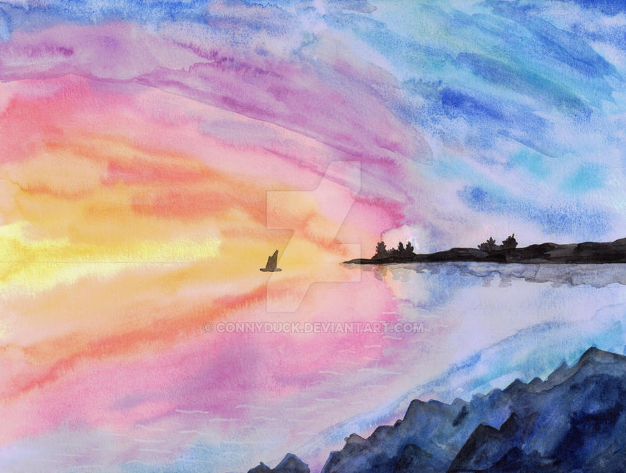
I love the colors in this painting! They're so bright, and the progression from cool to warm draws the eye toward the setting sun off to the left.
The symmetry between the colors in the sky and their reflection on the water is also incredibly visually satisfying.
However, you don't seem to have done much, if anything, to make sure that the sky and water look distinct from one another. Like, let's talk about depth. Calm, still water should look more or less like a flat, reflective plane coming straight out at the viewer; the horizon line in your painting could be understood as a cross section of that plane. The water should look much closer to the viewer than the sky, because it is. The water should also have some texture to it, and highlights not present in the sky to represent light from the sun glinting off of small waves or ripples in the water.
I do see some lines on the water that might be a step in that direction, as well as a reflection of the dark landmass on the right of the painting, but neither of those really accomplishes what I'm talking about.
I also have a problem with the two landmasses in this painting: the hilly shore on the right side of the horizon line and the rocky outcropping on the bottom right. They both look flat and cartoonish to me, especially the rocks.
That was a lot of negativity, so I am going to reiterate that I love the colors. The gradient from the yellow sun to the purple border between the sunset and the oncoming night -- and its duplicate reflected on the water -- is my favorite part of this painting. The two color gradients in the sky and the water lead the eye to the far left where the sun is setting, and where those two halves of the painting meet is where I get the strongest impression of two perpendicular surfaces. Flatness is a big problem with this painting, but those two color gradients go a long way toward overcoming it.